Mastering Tonal Dressing: Intentional Single-Color Outfits
Tonal dressing involves layering different shades and textures of a single color to create a cohesive and sophisticated outfit, elevating everyday style through intentional proportional choices.
Are you ready to elevate your wardrobe with a sophisticated yet simple approach? Mastering Tonal Dressing: 4 Proportions That Keep Single-Color Outfits Looking Intentional is your definitive guide to achieving effortlessly chic, monochromatic looks that exude confidence and style.
The art of tonal dressing: beyond basic monochrome
Tonal dressing, often confused with simple monochrome, is a nuanced art form that involves combining different shades, tints, and tones of a single color to create a rich, layered, and visually interesting outfit. It’s about creating depth and dimension without introducing new colors, resulting in a cohesive and sophisticated aesthetic. This technique goes beyond simply wearing all black or all white; it invites a playful exploration of a chosen hue's spectrum.
The beauty of tonal dressing lies in its ability to make an outfit feel more luxurious and thoughtful. By carefully selecting pieces within the same color family, you can achieve a polished look that appears effortlessly put-together. This approach also allows for greater versatility with your existing wardrobe, encouraging you to see your garments in a new light. It transforms ordinary items into a harmonious ensemble, proving that true style isn't always about bold contrasts but often about subtle harmonies.
Understanding the color wheel for tonal success
To truly master tonal dressing, a basic understanding of color theory, specifically the concept of tints, tones, and shades, is invaluable. A tint is a color with white added, making it lighter. A tone is a color with gray added, reducing its intensity. A shade is a color with black added, making it darker. Combining these variations within one color creates the rich tapestry of a tonal outfit.
- Tints: Lighten your chosen color, adding softness.
- Tones: Mute the color, providing sophistication.
- Shades: Deepen the color, adding intensity and drama.
- Monochromatic Harmony: Use these variations to build visual interest.
The strategic use of different finishes—matte, satin, knit, denim—further enhances the visual complexity of a tonal outfit. Texture plays a crucial role in preventing a single-color look from appearing flat or one-dimensional. A silky blouse paired with wool trousers and a cashmere sweater in the same color family creates a dynamic interplay that catches the eye. This thoughtful combination of shades and textures is what truly elevates tonal dressing from a simple color choice to a sophisticated style statement.
In essence, tonal dressing is about celebrating the richness and complexity of a single color. It encourages a more deliberate approach to styling, where each piece is chosen not just for its individual appeal but for its contribution to the overall chromatic symphony. By understanding and applying these principles, you can unlock a new level of sophistication in your everyday style, making every single-color outfit look incredibly intentional and chic.
Proportion 1: the 70/30 split for dynamic balance
The 70/30 split is a foundational principle in achieving dynamic balance within tonal dressing. This proportion dictates that approximately 70% of your outfit should be one dominant shade of your chosen color, while the remaining 30% consists of a lighter or darker variation of that same hue. This creates a visually appealing contrast that prevents the outfit from looking monotonous, adding depth and intentionality.
Imagine dressing in a deep navy blue. The 70% could be a pair of sleek navy trousers and a matching tailored blazer, forming the bulk of your look. The remaining 30% might be a lighter blue silk camisole peeking out from beneath the blazer, or a sky-blue scarf draped artfully. This subtle shift in shade provides a focal point and breaks up the potential uniformity, making the outfit feel more considered and less like a uniform.
Applying the 70/30 rule with accessories
Accessories are instrumental in executing the 70/30 rule effectively. They offer an easy way to introduce that 30% contrasting shade without overhauling your main garments. A handbag, shoes, or even jewelry can provide the necessary visual break and add another layer of sophistication to your tonal ensemble.
- Footwear: Opt for shoes in a slightly different shade or texture.
- Bags: A bag in a lighter or darker tone can be a powerful accent.
- Jewelry: Metallic accents or colored stones can complement the hue.
- Scarves: Introduce a subtle pattern or a contrasting shade.
Consider a monochromatic outfit in various shades of olive green. Your main pieces—a midi skirt and a knit sweater—could be in a consistent, rich olive. To apply the 70/30 split, you might introduce a pair of moss green ankle boots and a lighter sage green crossbody bag. These elements, while still within the green family, offer enough variation to create interest and break the visual plane, ensuring the outfit feels balanced and thoughtfully composed.
The 70/30 proportion is not about strict measurements but about visual weight and impact. It encourages you to think about how different shades interact and how to use them to create a sense of movement and dimension. By consciously playing with these proportions, you ensure your single-color outfits are far from boring, instead appearing sophisticated, intentional, and effortlessly stylish.
Proportion 2: the 50/50 split for bold contrast
While tonal dressing often leans into subtle variations, the 50/50 split introduces a bolder approach, creating a striking contrast within the same color family. This proportion involves dividing your outfit equally between two distinct shades of your chosen color—one significantly lighter and one significantly darker. The effect is dramatic and intentional, making a strong style statement.
Imagine pairing a crisp, bright white blouse with a pair of deep, rich ivory trousers. Both are within the white/off-white spectrum, but their distinct lightness and darkness create a powerful visual divide. This isn't about blending; it's about showcasing the versatility and impact of a single color through clear differentiation. The result is an outfit that feels modern, minimalist, and incredibly chic.
Creating visual interest with texture in 50/50 splits
When employing a 50/50 split, texture becomes an even more critical component. With such a direct contrast in shades, varying textures prevent the outfit from appearing too stark or disjointed. It adds a tactile dimension that softens the transition and enhances the overall richness of the look.
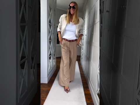
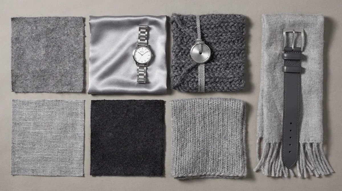
- Knit and Silk: A chunky knit sweater with a flowing silk skirt in different shades.
- Denim and Cotton: Dark wash denim jeans with a light wash cotton shirt.
- Leather and Wool: A sleek leather skirt paired with a cozy wool top.
- Matte and Sheen: Combine matte fabrics with those that have a subtle shine.
For instance, consider a 50/50 split in shades of brown. You could wear a light camel-colored cashmere sweater with a dark chocolate brown leather skirt. The contrast in both shade and texture is immediately apparent, yet the shared color family ensures cohesion. The softness of the cashmere against the smooth, structured leather creates a luxurious and dynamic ensemble that is anything but dull.
The 50/50 split requires confidence and a keen eye for balance. It’s about embracing the power of distinct shades within a single hue to create an outfit that is both cohesive and visually arresting. By thoughtfully combining contrasting tones and varying textures, you can achieve a look that is bold, sophisticated, and undeniably intentional, proving that single-color outfits can be far from monochromatic monotony.
Proportion 3: the 60/20/20 rule for balanced layering
The 60/20/20 rule introduces a more intricate layering approach to tonal dressing, allowing for the inclusion of three distinct shades within a single color family. This proportion suggests that 60% of your outfit should be the dominant shade, 20% a secondary, slightly different shade, and the remaining 20% a third, accentuating shade. This creates a nuanced, multi-dimensional look that is rich in texture and visual interest.
Envision a sophisticated ensemble in shades of grey. Your foundational piece, perhaps a pair of charcoal grey wide-leg trousers, makes up the 60%. A mid-grey knitted top or sweater could be your 20%, offering a subtle shift. The final 20% might be a light silver-grey blazer or a chic scarf, completing the layered look. This distribution ensures a harmonious flow while still highlighting the depth and versatility of the chosen color.
Incorporating subtle patterns for added interest
Within the 60/20/20 framework, subtle patterns can be introduced to further enhance the complexity of a tonal outfit without disrupting its single-color harmony. A pinstripe, a subtle houndstooth, or a delicate jacquard in one of the shades can add a touch of sophistication and break the monotony of solid blocks of color.
- Pinstripes: A blazer or trousers with subtle pinstripes in a complementary shade.
- Textured Knits: Sweaters with intricate cable knits or ribbing.
- Jacquard Fabrics: A blouse or skirt with a tone-on-tone jacquard pattern.
- Subtle Prints: A scarf or pocket square with a very faint, tonal print.
Consider an outfit built around the color beige. The 60% could be a classic beige trench coat. Your 20% might be a pair of cream-colored trousers. For the final 20%, you could choose a light tan silk blouse with a delicate, tone-on-tone floral jacquard pattern. This combination not only plays with shades but also introduces a refined textural and pattern element, making the outfit incredibly rich and intentional.
The 60/20/20 rule is perfect for those who enjoy a more layered and intricate approach to their style. It allows for greater creative expression within the confines of a single color, demonstrating how thoughtful proportioning can transform simple garments into a complex and captivating ensemble. By carefully balancing shades, textures, and even subtle patterns, you can achieve a truly sophisticated and intentional tonal look.
Proportion 4: the accent pop for unexpected vibrancy
While the essence of tonal dressing lies in its single-color harmony, the accent pop proportion introduces a strategic, small burst of a contrasting color. This isn't about breaking the monochromatic theme entirely, but rather about using a very small percentage (typically 5-10%) of a complementary or analogous color to create an unexpected moment of vibrancy. This technique ensures the primary tonal look remains dominant while adding an intriguing focal point.
Imagine an elegant all-grey outfit—charcoal trousers, a light grey sweater, and a mid-grey coat. To apply the accent pop, you might introduce a pair of vibrant red ballet flats or a small emerald green clutch. The pop of color is deliberate and contained, drawing the eye without detracting from the overall grey palette. It adds personality and a modern edge to a classic tonal ensemble, making the entire look feel more dynamic and less predictable.
Strategic placement of the accent pop
The success of the accent pop lies in its strategic placement. It should be used sparingly and thoughtfully, typically in an accessory or a small garment detail. The key is to ensure it enhances, rather than overwhelms, the primary tonal story. Think of it as a carefully placed exclamation mark in an otherwise serene sentence.

- Shoes: A bold colored shoe can instantly uplift a neutral tonal outfit.
- Handbags: A small, brightly colored bag adds a playful touch.
- Jewelry: A statement necklace or earrings with a vibrant stone.
- Scarves or Belts: A thin, brightly colored scarf or belt can provide a subtle pop.
Consider a beautiful all-cream outfit: a cream silk blouse, cream wool trousers, and a cream trench coat. To introduce an accent pop, you might wear a pair of deep burgundy loafers or carry a small sapphire blue clutch. These elements, while distinctly colored, are small enough not to dominate the cream base, instead adding a refined touch of contrast and intrigue. It shows an understanding of color and composition, elevating the entire look.
The accent pop proportion is for those who appreciate the elegance of tonal dressing but also enjoy a hint of unexpected flair. It allows for a subtle rebellion against strict monochromatic rules, injecting personality and contemporary style into classic single-color outfits. By mastering this delicate balance, you can create looks that are both cohesive and captivating, demonstrating a truly intentional approach to fashion.
Texture and fabric: the unsung heroes of tonal dressing
Beyond color proportions, the interplay of texture and fabric is arguably the most critical element in mastering tonal dressing. Without varied textures, even the most thoughtfully proportioned single-color outfit can fall flat, appearing one-dimensional and uninspired. It's the tactile and visual diversity that different fabrics bring that truly elevates a monochromatic look from simple to sophisticated.
Imagine an outfit entirely in shades of brown. If every piece—trousers, top, jacket—is made of smooth, untextured cotton, the result might be dull. Now, envision the same brown outfit with a chunky knit sweater, sleek leather trousers, and a flowing silk blouse. The visual and tactile contrast immediately creates depth, interest, and a sense of luxury. Each fabric catches the light differently, creating subtle shifts in perceived shade and adding dynamic movement to the ensemble.
Mixing materials for maximum impact
The art of mixing materials within a tonal palette requires a discerning eye, but the results are incredibly rewarding. It's about combining fabrics that offer distinct sensory experiences, both to the touch and to the eye. This strategic combination prevents the outfit from looking like a uniform and instead makes it feel rich and layered.
- Soft & Structured: Pair soft cashmere or silk with structured wool or denim.
- Matte & Shiny: Combine matte cottons or knits with glossy satin or leather.
- Thick & Thin: Balance bulky knits with delicate chiffons or fine silks.
- Smooth & Textured: Mix smooth fabrics with those that have a visible weave, like tweed or corduroy.
For example, in an all-black ensemble, you could pair a sleek black leather skirt with a soft black cashmere sweater. Add a black silk camisole underneath and finish with a black wool blazer. Each piece is black, but the varying textures—the smooth, reflective leather, the plush cashmere, the delicate silk, and the structured wool—create a symphony of visual and tactile interest. The outfit is undeniably cohesive, yet remarkably dynamic and far from boring.
Understanding and intentionally utilizing texture and fabric is paramount to truly mastering tonal dressing. It adds a layer of sophistication that color alone cannot achieve, transforming single-color outfits into intentional, high-fashion statements. By embracing the diversity of materials, you unlock the full potential of monochromatic styling, creating looks that are rich, dynamic, and effortlessly chic.
Accessorizing tonal outfits: the final touch
Once you've mastered the proportions and embraced the power of texture, accessorizing becomes the final, crucial step in perfecting your tonal outfit. Accessories are not just add-ons; they are integral components that can either reinforce the cohesive single-color theme or introduce a subtle, intentional contrast that elevates the entire look. The right accessories can transform a good tonal outfit into a truly exceptional one.
When selecting accessories for a tonal ensemble, consider them as extensions of your chosen color palette. They can be in the same shade family, adding another layer of depth, or they can provide that strategic accent pop discussed earlier. The key is thoughtfulness and restraint, ensuring each accessory serves a purpose in enhancing the overall aesthetic without overwhelming it.
Choosing metals and jewelry
Metals and jewelry play a significant role in adding polish and a touch of luxury to tonal outfits. Depending on your chosen color, certain metals will harmonize better than others. Gold tones often complement warmer hues like browns, oranges, and deep reds, while silver and white gold tend to pair beautifully with cooler tones such as blues, greens, and grays.
- Harmonious Metals: Match metal tones to your outfit's warmth or coolness.
- Statement Pieces: Use a single bold piece to draw attention.
- Layered Delicacy: Multiple delicate chains can add subtle sparkle.
- Colored Stones: Choose stones that are a darker or lighter shade of your outfit's color.
For an all-navy tonal outfit, silver or white gold jewelry would create a crisp, sophisticated contrast. A delicate silver chain or a pair of classic pearl earrings would enhance the cool tones of the navy without introducing a clashing color. Conversely, an all-camel look would be beautifully complemented by warm gold jewelry, perhaps a chunky gold bracelet or large hoop earrings, which would enhance the richness of the brown tones.
Beyond jewelry, consider belts, handbags, and scarves. A belt in a slightly different texture but the same color family can cinch a waist and add definition. A structured handbag in a deeper shade provides a sophisticated touch. A silk scarf with a subtle, tone-on-tone pattern can introduce an element of softness and movement. Each accessory, when chosen with intention, contributes to the overall harmony and sophistication of your single-color outfit, making it truly intentional and stylish.
| Key Proportion | Brief Description |
|---|---|
| 70/30 Split | Dominant shade (70%) with a lighter/darker variation (30%) for subtle contrast. |
| 50/50 Split | Equal parts distinct light and dark shades for bold contrast. |
| 60/20/20 Rule | Three shades: dominant (60%), secondary (20%), and accent (20%) for layered depth. |
| Accent Pop | Small (5-10%) contrasting color for unexpected vibrancy and focal point. |
Frequently asked questions about tonal dressing
What is the primary difference between tonal dressing and monochromatic dressing?▼Monochromatic dressing typically involves wearing a single, exact shade of one color. Tonal dressing, however, embraces variations within a single color family, utilizing different tints, tones, and shades of that color. This creates more depth and visual interest through subtle contrasts rather than strict uniformity.
How can I make a tonal outfit look intentional and not accidental?▼Intentionality in tonal dressing comes from carefully considering proportions, textures, and fabric choices. By mixing different shades and textures of the same color, and possibly adding a thoughtful accent, you create a layered and dynamic look that clearly signals a deliberate styling choice, not just a random selection of similar colors.
Is tonal dressing only for neutral colors like beige or gray?▼Absolutely not! While neutrals are popular for tonal dressing due to their inherent versatility, this technique can be applied to any color. From vibrant blues and greens to rich reds and purples, exploring the varying shades within any color family can create stunning and sophisticated tonal outfits that stand out.
How important are textures in a tonal outfit?▼Textures are incredibly important in tonal dressing. They add crucial depth, dimension, and visual interest to an outfit that might otherwise appear flat. Mixing fabrics like silk, wool, knit, and leather in the same color family creates a dynamic interplay that elevates the entire look, making it feel luxurious and thoughtfully composed.
Can I use patterns in tonal dressing?▼Yes, you can! Subtle patterns, such as pinstripes, tone-on-tone jacquards, or delicate prints, can be incorporated into tonal outfits. The key is to ensure the pattern remains within the chosen color family and doesn't introduce too much contrast, maintaining the overall harmonious and cohesive aesthetic of the single-color ensemble.
Conclusion
Mastering tonal dressing is an accessible yet profound way to elevate your personal style, transforming single-color outfits from basic to breathtakingly intentional. By understanding and applying the four key proportions—the 70/30 split, the 50/50 split, the 60/20/20 rule, and the accent pop—along with a keen eye for texture and thoughtful accessorizing, you unlock a world of sophisticated possibilities. This approach encourages a deeper appreciation for color and fabric, allowing you to craft looks that are rich in dimension, effortlessly chic, and uniquely yours. Embrace these techniques to confidently express your style with elegance and purpose every day.
